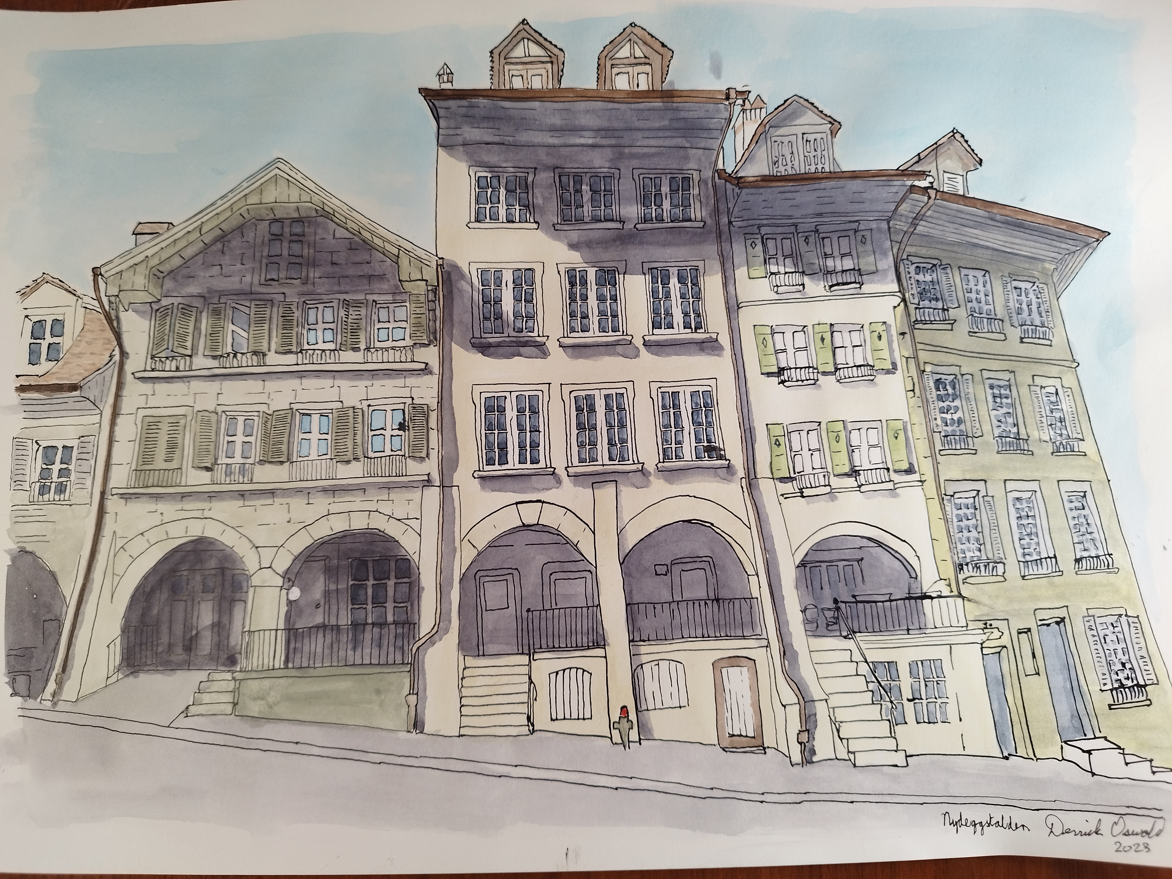
Nydeggstalden
I definitely prefer watercolour over ink outline, compared to just watercolour. It has more of the Beatrix Potter flavour, which is, I guess, the effect I’m aiming for.
I’m concentrating on architecture paintings, because people don’t stand still very long. In any case, people paintings will need a background. If you’re getting tired of the same thing every time, bear with me.
The learnings I take away from this painting are:
- when applying shadow, wet the area first with just water, otherwise it turns out blotchy - at least it does with Neutral Tint
- I still can’t do proper sky without falling back to my Ecoline Pastel Blue liquid watercolour
- windows take a lot of time, but it’s sort of acceptable to outline in ink and fill with Paynes Grey
- this should have been taken from a higher elevation so the trapezoids of tallness are less apparent
- do the shadows of furniture and small protubances with a small brush
- not everything needs to be coloured - paper white can be used to advantage (OK, call me lazy)
- it takes more than three hours if you want to do detailed work
- being bolder with colours pays off (compare to Mayhaus)
| Data | Description |
|---|---|
| Title | Nydeggstalden |
| Artist | Derrick Oswald |
| Medium | Watercolour and ink on acid-free, cellulose, fine-grained, natural-white paper |
| Dimensions (w × h cm) | 42 × 29.7 |
| Date | 2023 |
